Last week my long time friend and sometime collaborator Donald Kaufman shared some of his knowledge about light, color, and materials to a nearly full house at the New York School of Interior Design.
To set the tone for the evening’s discussion, Donald showed this legendary film clip from the 1948 movie Mr. Blandings Builds His Dream House, in which Mrs. Blandings (Myrna Loy) describes in ephemeral terms the ‘exact’ paint colors she was looking for in her Connecticut home.
The vintage movie clip reflects a version of aspirations any of us might have for a paint color we are seeking.
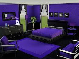
Certainly many of us have selected a paint colors from a swatch from the hardware store – maybe made a small sample -or not – and then painted the entire room that color and freaked out?
(perhaps a striking shade of grape?)
The color and the effect were not what you had imagined – something is wrong, very wrong.
It has been said that “practice makes perfect”, and while I imagine this could be true in some circumstances, selecting paint colors, like many things, can be tricky – very tricky.
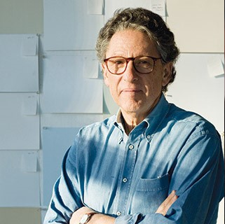
Enter the ‘Master’
Donald Kaufman utilizes a process that is both scientific and intuitive for selecting and developing fully custom paints and a highly edited selection of ‘standard’ colors. When combined with decades of experience, Kaufman creates paint colors that can be magical and remarkably transformative.
The Metropolitan Museum of Art, the Getty Museum, the Museum of Modern Art, Philip Johnson, Ian Schrager, etc. have all been his clients.
I myself have used Donald Kaufman paint for decades, so I know the magic they create from experience, and was thrilled when Donald accepted my invitation to speak at the New York School of Interior Design (NYSID) last week.
One of his ‘secrets’ is to use a full spectrum of pigments to create every paint (including white) resulting in dynamic and luminous paint surfaces that respond to their environments.
.
.
Donald brought his friend and long-time collaborator, interior designer Carey Maloney from the M(group), with him to talk in a casual format about the work they have done together and the impact of architectural color.

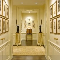
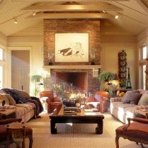
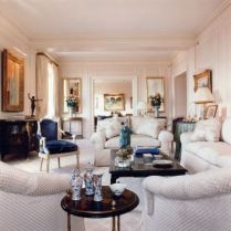
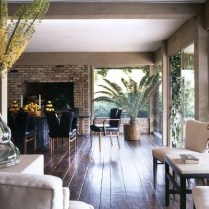
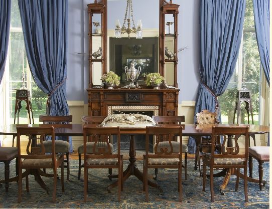
A selection of projects from the M(Group) portfolio which feature Donald Kaufman paint
.
This lecture was the first in an ongoing collaboration between ASID New York Metro and NYSID.
I want to thank David Sprouls, President, and Samantha Hoover, Director of External Relations at NYSID for their generosity in helping to development this new partnership, and look forward to future events.
And while we’re on the subject of color, these are a few of the book’s in my design library I would recommend for advancing your knowledge on the subject;
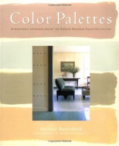
Color Palettes: Atmospheric Interiors Using the Donald Kaufman Color Collection by Susie Butterfield (Clarkson Potter)
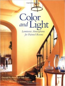
Color and Light: Luminous Atmospheres for Painted Rooms by Donald Kaufman
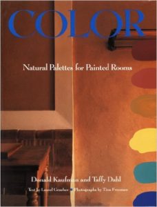
Color: Natural Palettes for Painted Rooms by Donald Kaufman
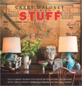
Stuff by Carey Maloney (Pointed Leaf Press).

