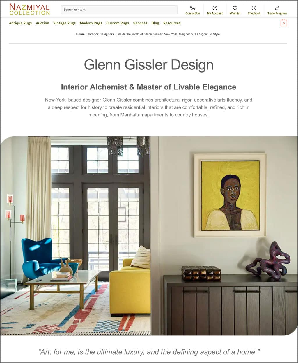
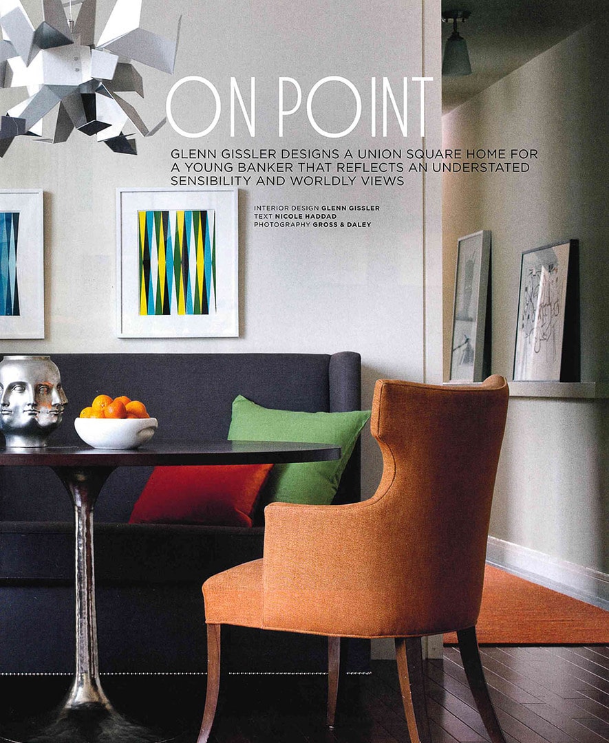
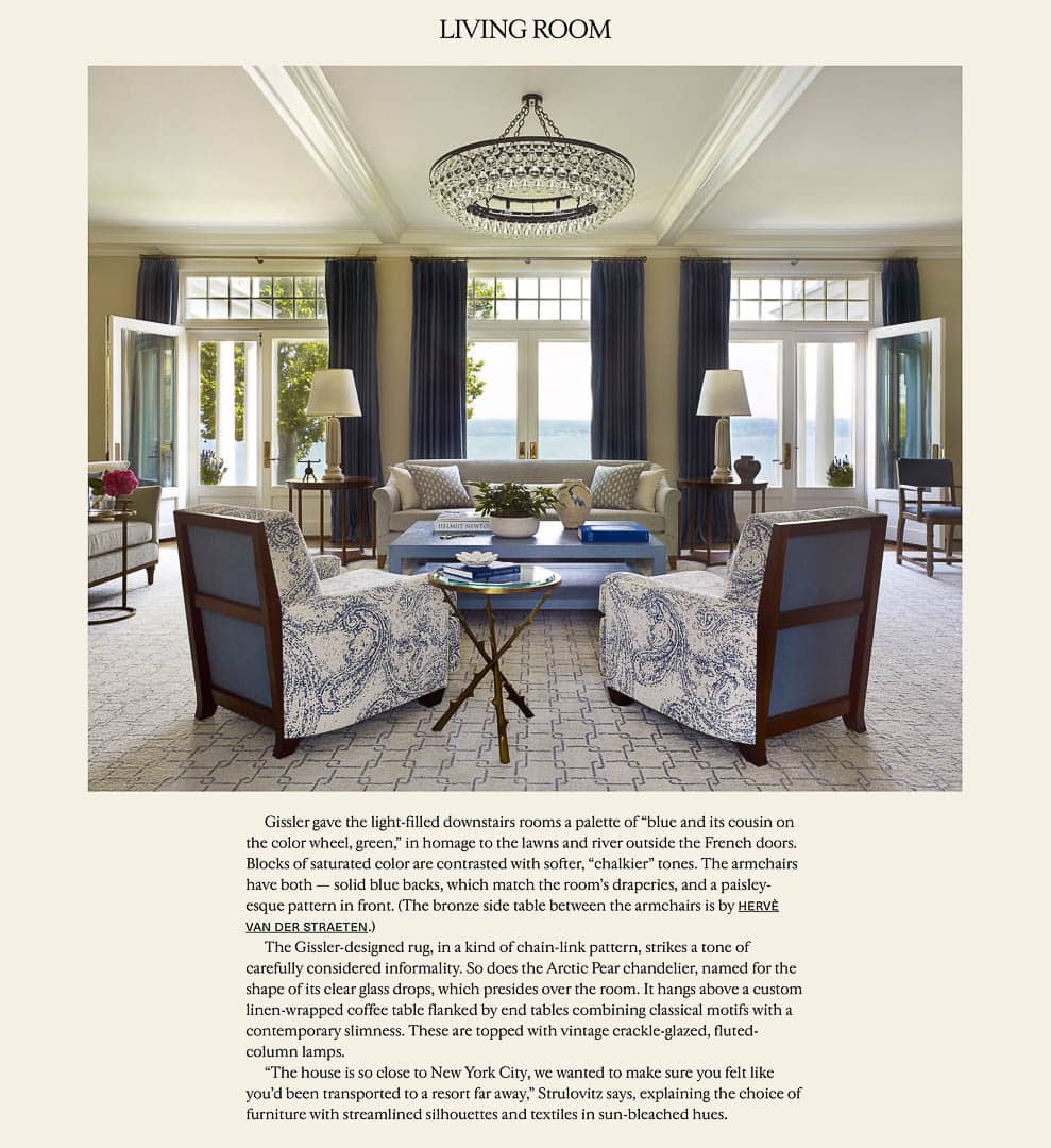
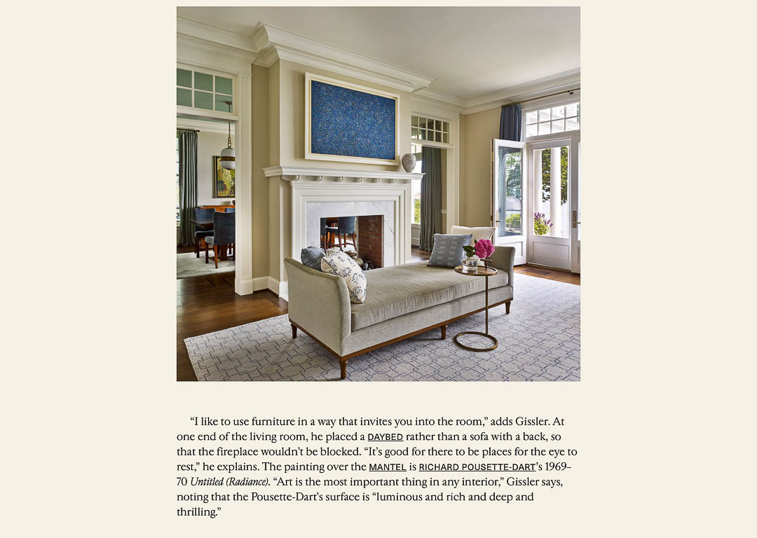
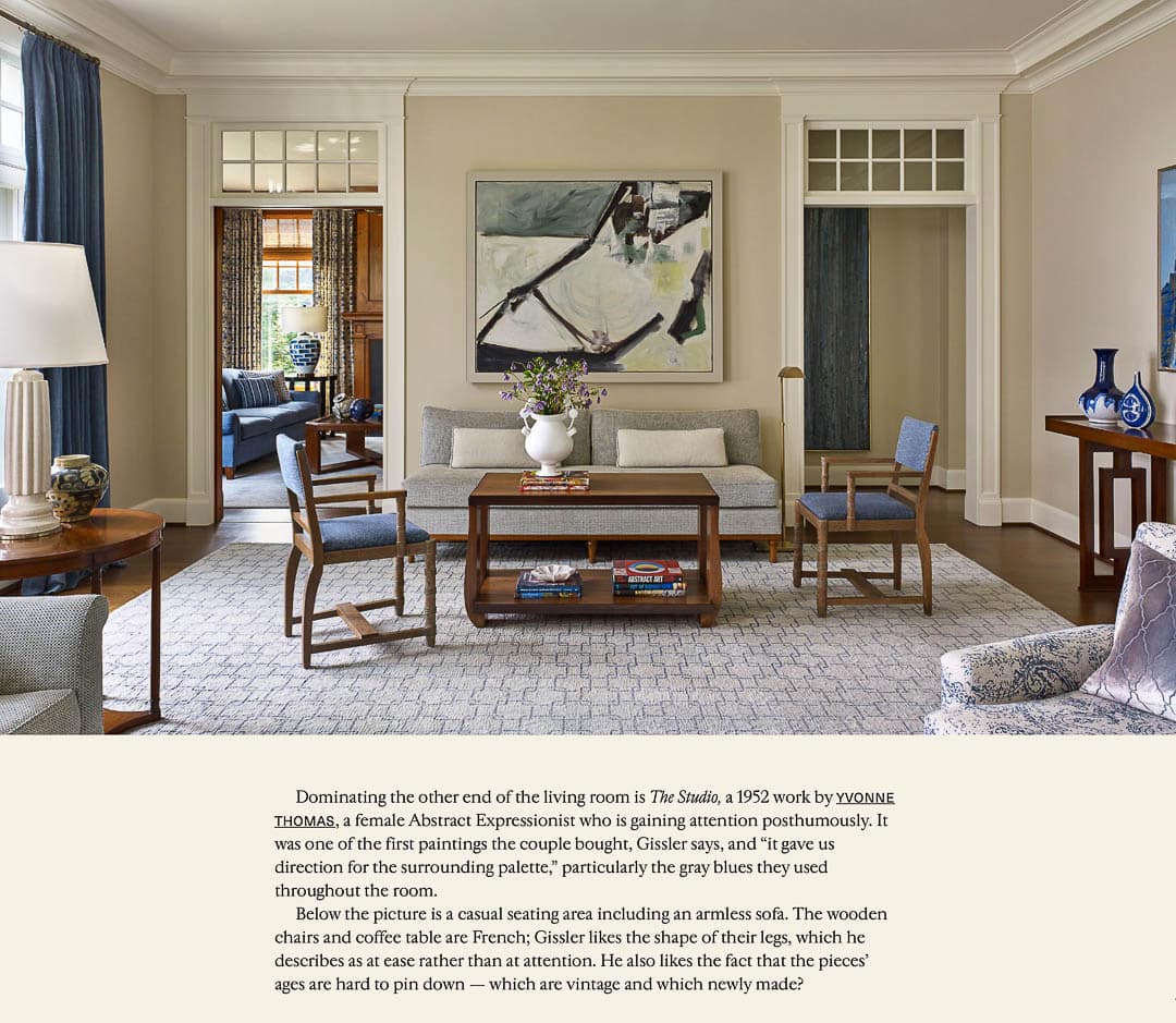
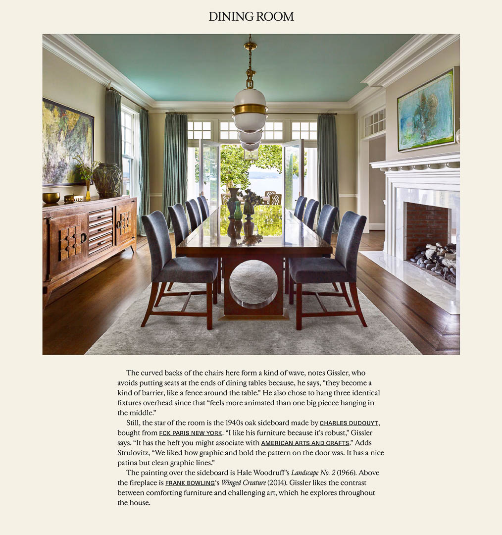
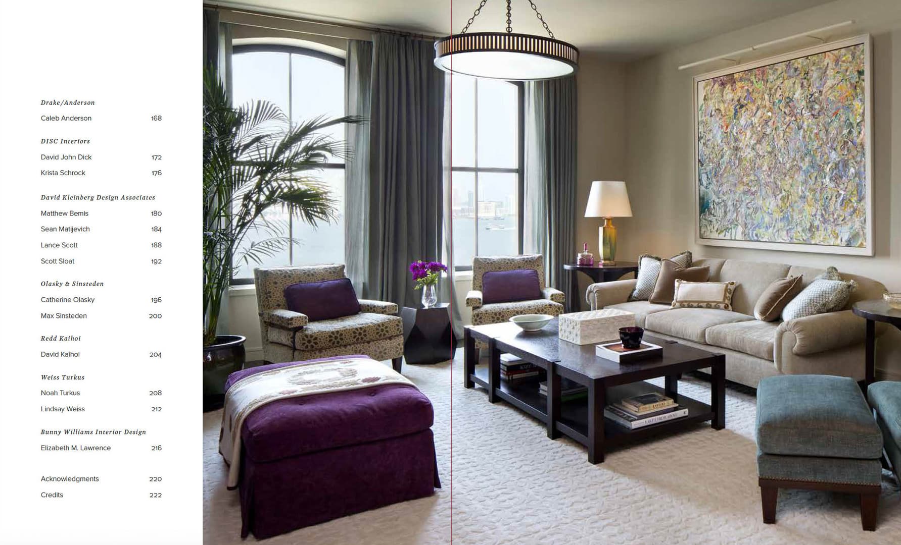
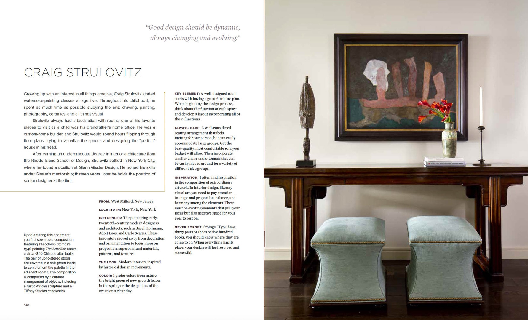
Upon entering this apartment, you first see a bold composition featuring Theodoros Stamos’s 1946 painting The Sacrifice above a circa-1830 Chinese altar table. The pair of upholstered stools are covered in a soft green fabric to complement the palette in the adjacent rooms. The composition Is completed by a curated arrangement of objects, Including a rustre African sculpture and a Tiffany Studios candlestick.
FROM: West Milford, New Jersey
LOCATED IN: New York, New York
INFLUENCES: The pioneering early twentieth-century modern designers and architects, such as Josef Hoffmann, Adolf Loos, and Carlo Scarpa. These innovators moved away from decoration and ornamentation to focus more on proportion, superb natural materials, patterns, and textures.
THE LOOK: Modern interiors inspired by historical design movements.
COLOR: I prefer colors from nature–the bright green of new-growth leaves in the spring or the deep blues of the ocean on a clear day.
KEY ELEMENT: A well-designed room starts with having a great furniture plan. When beginning the design process, think about the function of each space and develop a layout incorporating all of those functions.
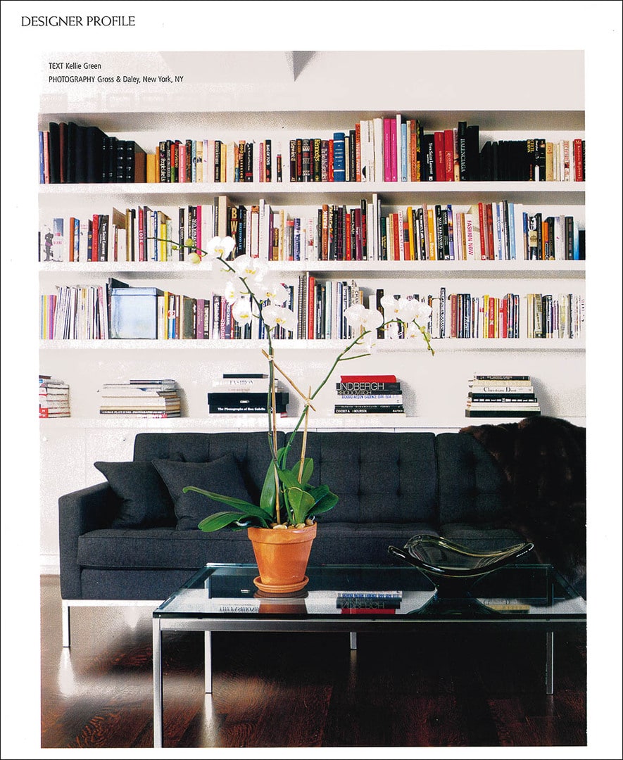
ALWAYS HAVE: A well-considered seating arrangement that feels inviting for one person, but can easily accommodate large groups. Get the best-quality, most comfortable sofa your budget will allow. Then incorporate smaller chairs and ottomans that can be easily moved around for a variety of different-size groups.
INSPIRATION: I often find inspiration in the composition of extraordinary artwork. In interior design, like any visual art, you need to pay attention to shape and proportion, balance, and harmony among the elements. There must be exciting elements that pull your focus but also negative space for your eyes to rest on.
NEVER FORGET: Storage. If you have thirty pairs of shoes or five hundred books, you should know where they are going to go. When everything has its place, your design will feel resolved and successful.