“Nothing is Original”

Sometimes we really just want to have some fun!
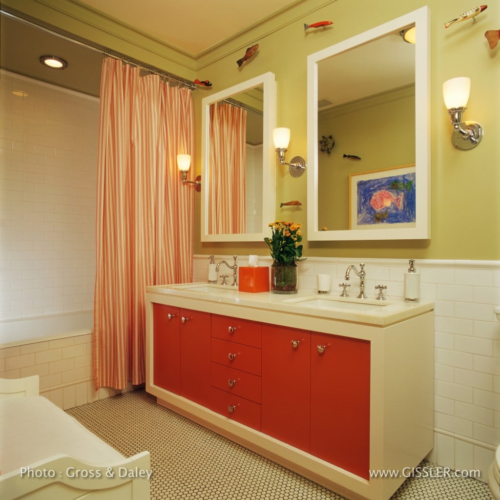
Two siblings, a boy and a girl, use this interior bathroom in a New York City apartment. While the public spaces of the apartment are understated, my clients and I decided to go for some hot colors in this bathroom.
I assert that “storage is a key to mental health” especially in New York City apartment, and to avoid any interpretation of favoritism with kids – everything needs to be absolutely equal! The vanity and medicine cabinets were designed to give both children equal storage, and lots of it. Outlets inside of the medicine cabinets power up electric toothbrushes out of sight, and the center drawer holds a blow drier that is plugged into an outlet underneath the counter so the unsightly cords are hidden when not in use.
The white subway tiles, and white penny-tiles are from Nemo Tile Company. The penny tiles on the floor have a dark grout to emphasize the shape of the tiles and camouflage the dirt that gets into grout.
The custom polished nickel ‘Sonoma’ wall sconces with glass shades are from Urban Archaeology.
The rectangular sinks are from Kohler, and the ‘Etoile’ low-profile faucet set with cross-handles is from Waterworks. The rectangular undermount ‘Iron Plains’ sinks are from Kohler; the countertop is Thasos.
A ‘Beach Street’ storage bench from Restoration Hardware provides storage for additional towels and tub toys.
Lets not forget about the colorful elements of this room – ihe inset panel on the vanity is Benjamin Moore Habanero Pepper # 1306, the wall color is from the Donald Kaufman Color Collection – DKC-63. The custom shower curtain is made from ‘ Granville Stripe’ from Hinson Fabrics.
.
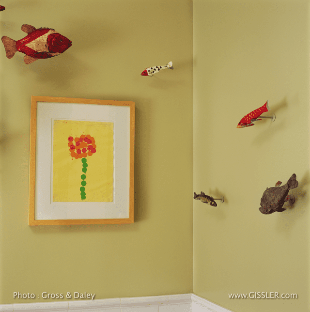
Now for the fish ‘swimming’ on the wall; they are vintage ice fishing decoys – used in an off-beat sport in the mid-west. The owners had a handful (that were supplemented by purchases on eBay), custom mounts were made to install them on the wall.
Framed drawings of fish and flower is by the children – one each – so everything is even-Steven!
;
.
Madeline Weinrib was focused on her painting career during the 1980’s and 90’s, and then in 1997 she created a line of contemporary area rugs for ABC Carpets as a means of expressing her painterly sensibilities into a woven medium.
The rugs were a big success both commercially and with the design industry media; she seemed to have hit a sweet spot in the marketplace with her bold patterns and bright colors.
Now, more almost two decades later, and with a staff of over 30 people and a much more complex operation, Madeline began seeking support on running the business from someone inside the industry, someone who could understand and appreciate the creative process.
She found that person….

I have never been to the Himalayas, and was born after 1951; but I have been empowered numerous times in my adult life by a passage in the the writings of a Scotsman who did climb the Himalayas in that year.
Perhaps it will have meaning for you too…..

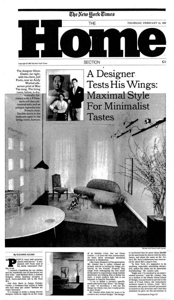
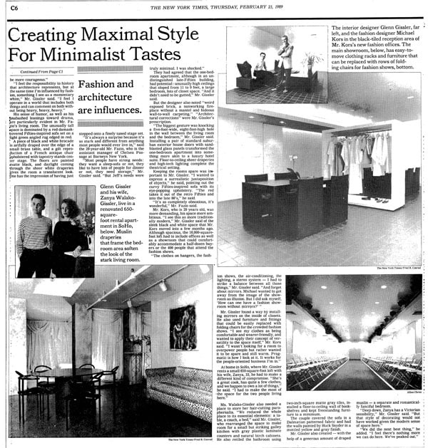
Last Thursday was the last day of the HOME Section of the New York Times; there are many of us who lament this change, remembering when the section was a very important source of news about the world of design.
I look back with great appreciation for the countless things I learned from this section, never mind that my first real media exposure was in the HOME section in February of 1989 – just two years after I opened Glenn Gissler Design.
I was introduced to the most important and the most influential HOME section writer, Suzanne Slesin, at an opening at Furniture of the Twentieth Century. I contacted her a few days later with hopes of showing her a few recently completed projects.
Suzi came to see three projects, and literally days later “A Designer Test His Wings; Maximal Style for Minimalist Tastes” appeared on the front page of the HOME Section! Including the jump page the story covered five square feet (!) of New York Times ‘real estate’ including seven photographs, three of which included me.
I nearly died!
The HOME Section has been a mere shadow of itself for many years; there are few people who would argue that. Some even see this change as a death knoll for design coverage in the New York Times.
At least for the moment I am looking at the glass as ‘half-full’, and I am hopeful that the nay-sayers will be proven wrong.