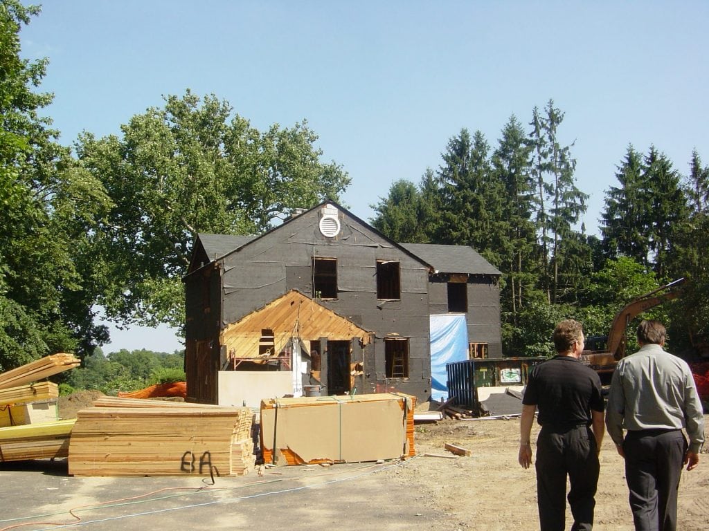
A number of years ago I worked on an all-but-tear-down renovation in Rye, New York. This image shows the ‘house’ when the demolition of the existing house was nearly complete.
Today my client sent me a number of unsolicited snap-shots of the property now that the plantings have matured and softened.
It is deeply satisfying to know that my clients are happy, and that the blood, sweat and tears that went into making the project happen was worth it!
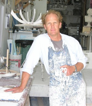
Stephen Antonsonis well known among the design cognoscenti for his lean, elegant, chalky white plaster light fixtures and objects inspired by Isamu Noguchi, French 1940’s lighting, and Diego Giacometti .
Initially inspired by Frederic Edwin Church’s paintings of icebergs, it was five years ago that Antonson began collecting vintage images of icebergs – intrigued by their monumental scale and ephemeral qualities, and the fact that the icebergs in many of the photos have disappeared.
What started as an ‘interest in icebergs’ became a fascination, and then became an obsession leading Antonson to create his new broad ranging ‘Shackleton Collection’…
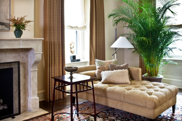
One of my goals in furnishing Living Rooms is to create places that the owners are drawn to use, if even by themselves.
In this spacious Upper West Side Living Room I designed a daybed to sit near the fireplace – bathed in daylight from three windows, it makes an ideal place for reading. The design was intended to be both classic and modern, while being extremely comfortable – my ‘go-to’ upholsterer, Jonas, came through once again! The daybed is upholstered in “Tahira Ottoman” from Lee Jofa.
Chelsea antique dealer Kimcherova provided the Vienna Secession Side Table by Gustav Siegel produced by J & J Kohn c.1905.
Another distinctive Austrian item is the circa 1950’s modern floor lamp by J.T Kalmar which was found at the extraordinary lighting dealers at Retro-Modern in Greenwich Village
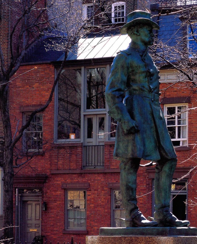
I know that I am not alone in thinking that the historic West Village is the best neighborhood in New York City!
If you have ever wandered around in the West Village it is likely that you have walked right past one of my favorite houses in New York City – hiding in plain view!
I have had the pleasure of visiting this house on more than one occasion and want to share some of the things that make it so special….
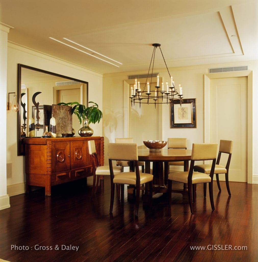
In this dining area in a new York City loft, the design intention was to create both openness and grounded-ness.
That may sound like a contradiction, but there was thoughtful intention behind these potentially contradictory goals.
This loft has a challenge that is not uncommon with lofts – a lot of space but not a lot of windows: in fact this dining area is over 30 feet from the nearest window!
To help bring the sense of openness and light to this area I had an enormous mirror made to sit behind, not over, the large sideboard.
Because the dining area was floating in a very large open space, I employed a number of ‘tricks’ to ground the space. I interrupted the large expanse of ceiling employing drywall reveals from Fry Regletto quietly mark the space. To further reinforce the center, I hung an antique iron chandelier over a substantial 70″ diameter ‘Aspen’ table from Holly Hunt Studio. The table issurrounded by‘Russell’ side chairs from Dessin Fournir, upholstered in a Great Plains‘Toscana’ leather.
The robust French 1940’s oak sideboard designed by Charles Dudouyt, came from Henry Maus Antiques. A collection of multi-cultural artifacts including a cast iron fireback from Amy Perlin, some mid-century ceramics, and an oversized mercury glass vase are reflected in an enormous mirror from Bark Frameworks. Patrick Naggar designed the ‘Bubble Wall Sconces’ from Ralph Pucci.
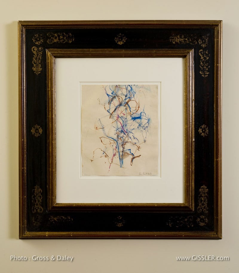
The space between the two pocket doors that lead to the Kitchen became the place for a very special drawing by the Abstract ExpressionistJoan Mitchell. The drawing came from the estate of Jean-Paul Riopelle, a French painter, who had a long and stormy relationship with Mitchell for nearly twenty years in France – it is a gem.
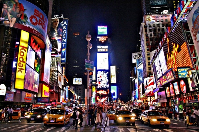
Chances are if someone mentions ’42nd Street’ you will think Times Square.
Unlike many New Yorkers, I really do like Times Square – not the tourists, not the shops, or the restaurants; I am not even a huge fan of big Broadway shows – I just LOVE the spectacle of the space, the lights, and the energy of it all.
But this post is NOT about Times Square…
As a follow up to my recent post about historical preservation in the city, I want to share a ‘self-invented self-guided walking tour’ I took when I was still an architecture student in he early 1980’s of some magnificent spaces on the much less frenetic EAST 42nd Street…
We use cookies on our website to give you the most relevant experience by remembering your preferences and repeat visits. By clicking “Accept”, you consent to the use of ALL the cookies.
This website uses cookies to improve your experience while you navigate through the website. Out of these cookies, the cookies that are categorized as necessary are stored on your browser as they are essential for the working of basic functionalities of the website. We also use third-party cookies that help us analyze and understand how you use this website. These cookies will be stored in your browser only with your consent. You also have the option to opt-out of these cookies. But opting out of some of these cookies may have an effect on your browsing experience.
Necessary cookies are absolutely essential for the website to function properly. This category only includes cookies that ensures basic functionalities and security features of the website. These cookies do not store any personal information.