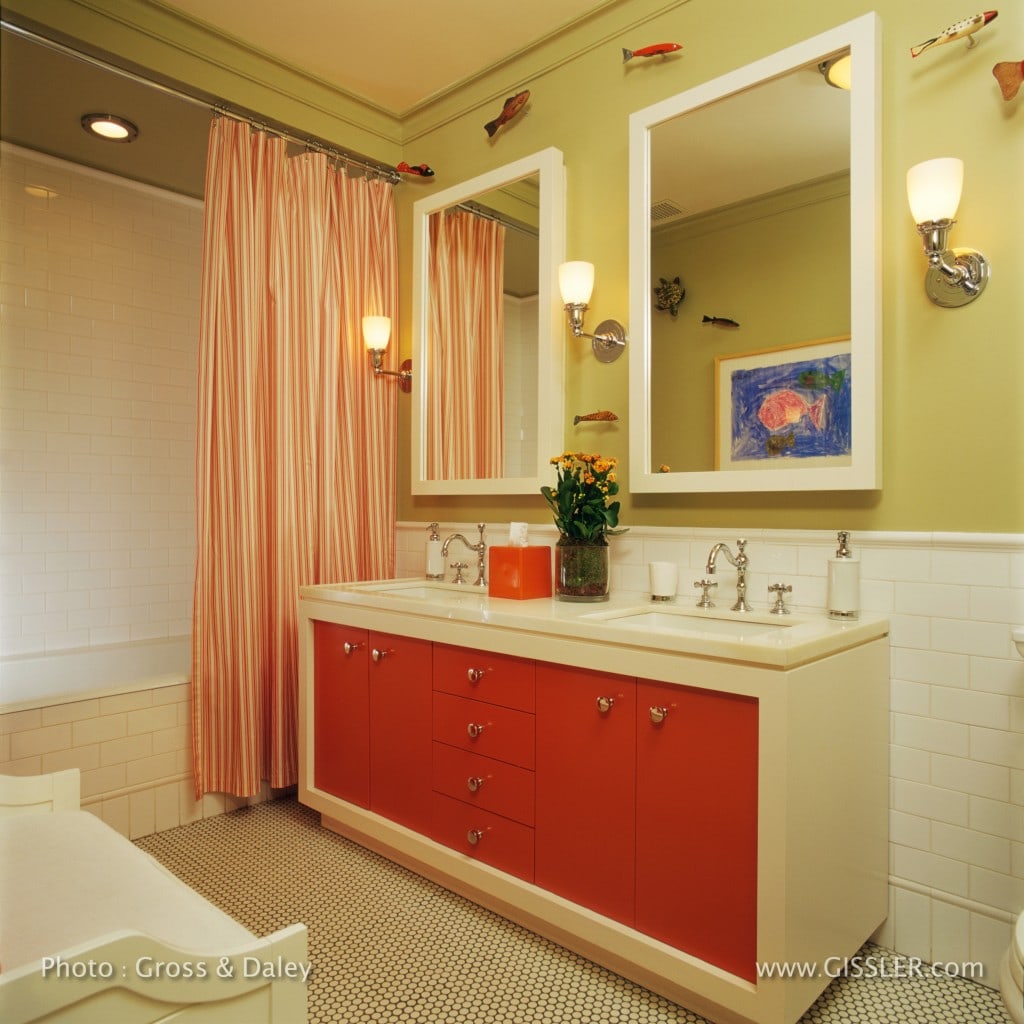
Two siblings, a boy and a girl, use this interior bathroom in a New York City apartment. While the public spaces of the apartment are understated, my clients and I decided to go for some hot colors in this bathroom.
I assert that “storage is a key to mental health”especially in New York City apartment, and to avoid any interpretation of favoritism with kids – everything needs to be absolutely equal! The vanity and medicine cabinets were designed to give both children equal storage, and lots of it. Outlets inside of the medicine cabinets power up electric toothbrushes out of sight, and the center drawer holds a blow drier that is plugged into an outlet underneath the counter so the unsightly cords are hidden when not in use.
The white subway tiles, and white penny-tiles are from Nemo Tile Company. The penny tiles on the floor have a dark grout to emphasize the shape of the tiles and camouflage the dirt that gets into grout.
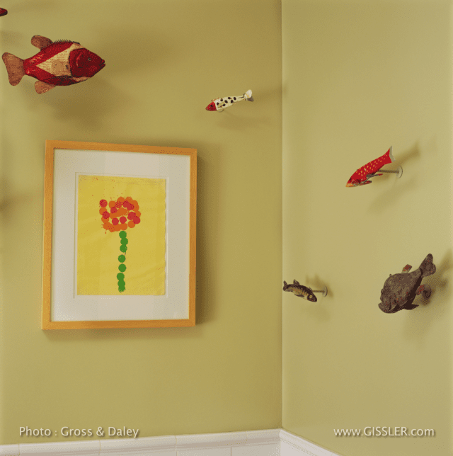
Now for the fish ‘swimming’ on the wall; they are vintage ice fishing decoys – used in an off-beat sport in the mid-west. The owners had a handful (that were supplemented by purchases on eBay), custom mounts were made to install them on the wall.
Framed drawings of fish and flower is by the children – one each – so everything is even-Steven!
Madeline Weinrib was focused on her painting career during the 1980’s and 90’s, and then in 1997 she created a line of contemporary area rugs for ABC Carpetsas a means of expressing her painterly sensibilities into a woven medium.
The rugs were a big success both commercially and with the design industry media; she seemed to have hit a sweet spot in the marketplace with her bold patterns and bright colors.
Now, more almost two decades later, and with a staff of over 30 people and a much more complex operation, Madeline began seeking support on running the business from someone inside the industry, someone who could understand and appreciate the creative process.
In the world we live in people often feel compelled to express grandiose reaction to things, experiences and people – resulting in the overuse of three words:
“I LOVE IT!”
Is this grandiosity yet another effect of the celebrity-driven-reality-TV-selfie times in which we live?
Are people living their lives as if the cameras are rolling?
Or is it a devaluation of LOVE?
Shopping for clothes:
“I LOVE IT!”
Looking at furniture:
“I LOVE IT!”
After hearing a joke:
“I LOVE IT!”
Looking at Art:
“I LOVE IT!”
etc., etc., etc…
For me, LOVEis a big and meaningful word.
Perhaps this attention to the ‘meaning’ of words is due to the influence of my father, an accomplished journalist f0r whom words have real meanings, and should be used judiciously.
Having a strong emotional reaction to things, experiences, and people is something I understand. In fact, beauty, delight – and yes, even love – are essential ingredients for me in the process of living, and in the process of design; but I am seeking an enduring love, not a momentary crush. I have found that the novelty that can incite a crush rarely stands the test of time.
Sometimes the subject or object or person at hand is suitable, good, great, excellent, superb, perfect, incredible, even inspired; however sometimes it is just fine, the sensible thing, perfectly appropriate, in good taste, a great solution, but it doesn’t necessarily evoke “I LOVE IT!”
Whether it is my own reaction, or someone else’s, I am suspect of the immediate “I LOVE IT!”response. Will the feeling last? Or is it merely a novel rush of adrenaline? Never mind that these three words can sound disingenuous, if not utterly meaningless.
Much of what I do as a designer is to identify, and then solve problems, LOTS of problems requiring LOTS of solutions. Experience, logic and intuition play significant roles in this problem solving; and no I don’t LOVEevery solution. I am in pursuit of a kind of alchemy. This alchemic phenomenon can occur when the cumulative effect of experience, collaboration, invention, a thoughtful approach and intuition are brought to bear in problem solving; where this combination of considered choices results in layered, nuanced, interesting, intelligent, subtle and maybe even sublime, spaces and experiences that can evoke a deep-seated LOVE, one that endures over time like a wonderful and satisfying personal relationship.
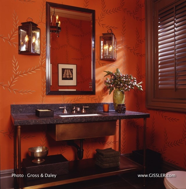
A bold wallpaper called‘Antinous’ designed by the Viennese designerDagobert Pechein 1922 is the dominant element in this Central Park West Powder Room, and is available through the shop atThe Neue Galerie.
The patinated bronze washstand was fabricated by Klaxto Vederstein with honed Uba Tuba stone top, while the ‘Aero Retro‘ lavatory fittings in satin nickel sink are from Waterworks.
The custom ‘Cay Lanterns’ with two candles and antiqued mirror backs are from The Urban Electric Co. The Arts & Crafts suspended ceiling light was found on eBay.
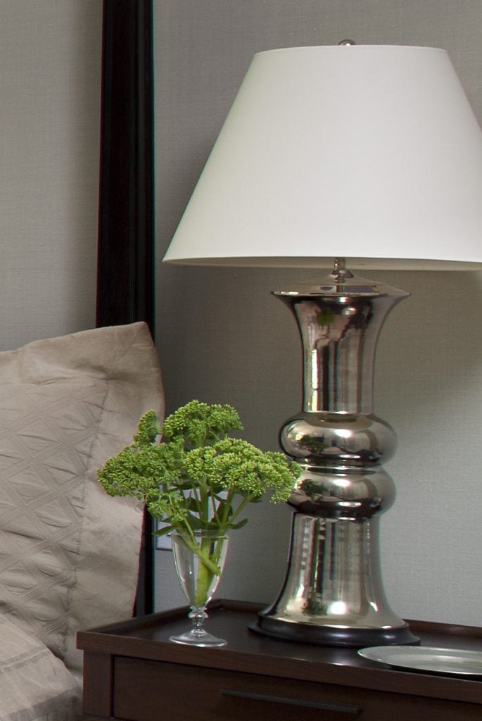
What’s not to like about Christopher Spitzmiller lamps??
.
I am on a continuous search for distinctive lighting for all of my design projects, and tend to avoid manufactured lamps, with the exception of Christopher Spitzmiller.
Crafted by hand and with heart, the lamps have been wonderful additions to a number of my projects (as evidenced in the image of a bedside table above.)
Who is Christopher Spitzmiller? What is it about his products that are so special? And what’s next? I decided to investigate…
We use cookies on our website to give you the most relevant experience by remembering your preferences and repeat visits. By clicking “Accept”, you consent to the use of ALL the cookies.
This website uses cookies to improve your experience while you navigate through the website. Out of these cookies, the cookies that are categorized as necessary are stored on your browser as they are essential for the working of basic functionalities of the website. We also use third-party cookies that help us analyze and understand how you use this website. These cookies will be stored in your browser only with your consent. You also have the option to opt-out of these cookies. But opting out of some of these cookies may have an effect on your browsing experience.
Necessary cookies are absolutely essential for the website to function properly. This category only includes cookies that ensures basic functionalities and security features of the website. These cookies do not store any personal information.